Archives

Posts Tagged ‘mobile friendly website’

Why a Responsive Web Design is Important?

Web masters when developing a site may add several features to make the site more effective. However one of the most critical issue in web designing is developing responsive website that is mobile-friendly.

Mobile devices such as smartphones and tablets are taking over internet surfing and as a web design come up with a mobile friendly website. They are becoming more widely used in web shopping, finding content online. For this reason it is advisable to come up with a responsive web design that is user friendly.

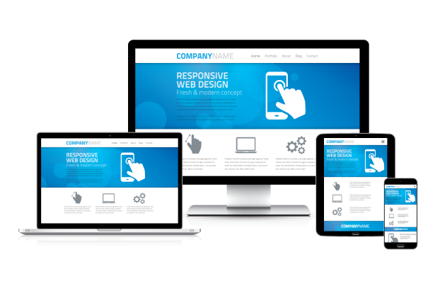
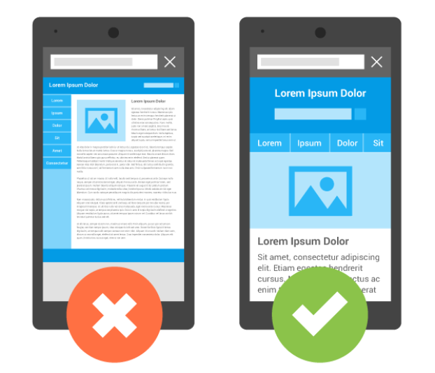
A responsive web design refers to a web site that can be viewed in different devices. A desktop can receive a site design with multiple columns of content while a small screen can have that same content presented in a single column with text and links that are appropriately sized to be read and used on that smaller display.

Importance of a responsive web design:

1.Support multi-device user

A responsive web design support a person who uses many devices to access to any content in the web. Due to technology advancement we are living in the world where not only do customer visit sites using different devices but they may also return to these sites using this different devices interchangeably. Therefore, designing responsive website give your customers no restriction to your site regardless the devices that is near them. If a customer may try and access your site on a mobile device and does not get the information, he/she may leave your site for more mobile friendly website.

2. Search engine optimization

Search engines i.e. google recommend responsive web design. A responsive web design has one URL no matter which device it is viewed on. This allows search engine to crawl through and improve the ranking of your website. Also google started rewarding the mobile friendly sites and they are visioning to make these sites rank higher.

3. Saves time and money

People have notions that responsive website designing is costly. But I say no because when developing other conventional design you have to count the cost of duplicating the site on other mobile devices. Designing responsive website cut the cost as the site is mobile friendly. It also saves the time you would have spent on the designing the website for the mobile devices.

4. Reduces bounce rate

Designing responsive website will reduced the rate at which the visitors leave the site after viewing only on page. This is because they are easy to navigate thus reducing frustration hence creating interest. You’ll get less website bounce rate by using a responsive web design.

Conclusion

Designing a mobile friendly website is recommended by google as it allow viewing on different devices. It also make your SEO strategy easier to carry out. For these reasons, responsive web design is the best option for your mobile SEO strategy.


Top 6 Advantages Of Mobile Friendly Website

What is a mobile friendly website?

A mobile friendly website is a website where you can access it on a desktop and on your electronic device from anywhere . A mobile website makes it easier for people on phones to access a certain business website with an easy layout on their phones.

Mobile friendly  websites compact down the desktop version of the website down to a smaller easier to read on mobile devices.Web Design in India providing you the best responsive website designing services.

Today I’m going to show you the top 6 advantages of mobile friendly website.

1. Mobile friendly websites have an easier layout :

The layout of most mobile friendly websites have tabs and menus that mobile friendly websites can access and view.

2. Mobile friendly websites can be accessed anywhere at anytime .

This is important because sometimes you need full access to a companies website and information at certain times, having a mobile website can help your business as well as reviews

3. More customers and more profit

Mobile friendly websites can give business owners more customers and more profit from ads and also from traffic to and from their mobile website.

4. New learning experiences

Mobile websites give opportunities and new learning experiences to job owners and staff. This is by showing them the new ways of getting their product or service across people and their love of technology.

5.Appealing website

There are many options that you can apply to mobile friendly websites such as more designs, many colors, and better layouts to their website that makes it easier on the eyes.

6.Easy navigation

The last advantage of a mobile friendly website is that mobile friendly websites are a new thing going around the economic and business department. They are having more and more customers coming to the mobile friendly websites than the desktop websites that they have now. Making mobile friendly websites easier and faster to navigate.


Above in the article I stated the 6 main advantages of mobile friendly websites and also gave information about what a mobile friendly website is and how it can help consumers and marketers in the long run. Mobile friendly websites are a huge advantage to the business economy in 2015 with all of the new technology and smart phones.

You can make your website mobile friendly by making sure that on your mobile phone it is clear and easy to read and that everything makes since and gets your point across. Keeping the mobile website fresh and interesting brings new customers that are intrigued by the work and effort that you put into your mobile website. And that concludes this article of The 6 Advantages Of Mobile Friendly Websites.

Advantages Of A Mobile Friendly Website

Today the desktop computers have become outdated and replaced by laptops. Now because of the growing trend of tablets and smartphones, the demand of laptop is also episodic because the mobiles of this era are made in a way that one can do many things using just a mobile which once were only possible to have done with the help of computer. This is why the pioneers of Website Designing have found a solution to create responsive websites. Responsive website is a professional term in Website Designing which actually means a mobile friendly website. Web Design in India is also updated to design the websites which are made easy to use on mobile.

Below are Some Vital Benefits of Mobile friendly Website

  • Mobile friendly website improves the user experience in a way that people of this century send links via SMS to each other. If the website is mobile friendly then the one who receives the link will be able to have an excess to that site easily. Web Designing has this solution that to create a website in a way that it is mobile friendly.
  • The responsive Website Designing is productive for an ecommerce website in a way that it targets the all kind of web users, either they are online from their computers or from mobiles.
  • Web Designing of responsive websites is no more difficult due to the advancement of technology. Now Web Design in India is also responsive and mobile friendly so that it can target as many people as it can.
  • People want to save their time. For the sake of this responsive Website Designing is necessary because the website which is not mobile optimized takes too much time to load if one has to open it on mobile phone.
  • Mobile friendly website’s SEO is easy and also according to the Google the Web Designing of your any website must be mobile friendly if you want to achieve better results on search engines.
  • Web Design in India is developing Mobile friendly websites because it is believed that this is necessary to compete with the respective competitors in the market.
Top 5 Tips to make your website mobile friendly

A great deal of people own a smartphone or a smart device, and more than half of them are using them to connect to the Internet. Not a surprise, but this number is increasing at a surprising rate every day. Today many people are going with websites for their businesses, for it not only brings about a great deal of customers but it expands your reach worldwide. When you hire any website designing services, they’ll tell you that you that making your website mobile friendly will boost your revenue greatly. Just make sure that you follow these five tips along with some bonus tips right down to every alphabet to get the best mobile friendly website for your business.

Start from the bottom

Mobile users are usually looking for directions and contact information, so make sure that you put such information on top, where it is easy to find. A link to your address on Google Maps is an added bonus. Make sure that you include a contact button in the header so that your customers can easily get to you.

Limited Images

Make sure that you limit the amount of images on your website. It is ok to use images but make sure that you use them wisely and that you compress them in order to deliver a hassle free experience for your customers.

Design for small screens

While many designers make use of responsive designs during their web designing exercise, make sure that your design is enhanced for the screens of smartphones. Avoid the frustration by making sure that the buttons and the white space is not hindering the user’s experience.

Limit the amount of text to be entered

Filling out a lengthy form on smartphones can be a nuisance. So make sure that you limit the amount of text required from your users.

Remove the unnecessary content

Seeing someone in public squinting at their phones can be a hilarious site. Make sure that you cut down on the content to help your customers get the desired information as soon as possible.

Simplify the navigation

Mobile screens are not as big as laptops’ so make sure that you make the website’s navigation as easy as possible. Try collecting feedback from your user to know what they want, and make changes accordingly.

Get Professionals

When you feel like you come up with a way to work on your website, make sure that you hire a website designing company in India, for they will make sure that you get what you pay for.

Test

Finally make sure that your website works across all of the platforms. There are a lot of tools which help you see how your website looks on various devices ranging from iPads, Android and Windows Devices. You don’t have to buy every device to test your website.

There you have it. Make sure that you follow these 10 tips to get the best mobile friendly site for your business.