Web Design Blog

Web Design India & SEO India Blog

Is a Responsive Website Design Easier to Crawl by Google?

How a responsive website design affects a website search engine ranking?

The answer to this fundamental question has never been of more importance than now when the ranking of websites on search engines is hugely dependent on their structure and mode of presentation.

As a webmaster, it’s vital that you’ve a grasp of the different search engine ranking metrics and how Google search bots crawl through your website.  It’s only then that you can structure your webpages appropriately. In this guide, learn how leveraging on a responsive website design impacts on how Google search bots crawl through your website.

What is responsive website design?

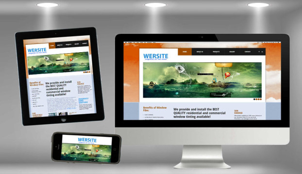
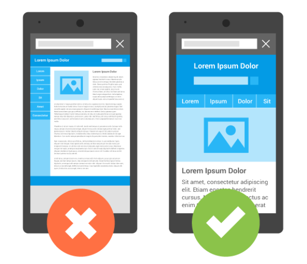
This is a website designing approach that responds to the needs of different internet users who employ different screen sizes to surf the web. The layout of the webpages is resized to fit into the user’s screen without affecting their viewing and interaction experience.

Mobile website versus responsive website;

To an inexperienced webmaster, there is little to separate between a normal website and a responsive one. But differences abound. Basically, a mobile website is copy of your main website that is specifically tailored for viewing on mobile devices. Such a website reformats itself to suit the screens of handheld or tablet devices.

A responsive website, on the other hand, is a designing approach aimed at making the main website easy to read on the different screen sizes. The webpages readjust on-the-fly to suit the various screen sizes. In a nutshell, a mobile website is tailored for mobile device users while responsive website design approach promotes multi-platform usability of the site.

How Google crawls through responsive websites?

All the content of a  google friendly website design are contained on the same URL. This means that when a user keys in phrases related to a specific website, Google search bots will only to crawl and index a single version of your site. This saves time and reduces the time it takes to return results to a given query. Ultimately, Google favors such sites as the load time is usually lower and search more concentrated.

A responsive website also has a lower bounce rate. Consequently, Google considers such websites as credible and authoritative in the eyes of a user. It thus crawls and indexes such sites more often leading to a higher on the results pages.


Offering great experience to internet readers has become a necessity in the internet world. And there isn’t a better way to cater for the needs of your users than leveraging on a responsive web design. It attracts search bots to your website ultimately improving its visibility to the world.

Top 6 Benefits of Choosing WordPress CMS for Web Design

What is WordPress CMS?

The success of any website is largely dependent on the content management system it is based on. Essentially, the CMS either boost or limit its scalability, customization and other core changes that come with an expanding website. While there are hundreds of open source programs that you could base your CMS database on, WordPress remain the most versatile content management system suiting both small blogs and large e-commerce websites.

If you are a professional web designer in India, here are 6 key reasons to use WordPress CMS for your web designing endeavors.

1. Easy to build websites based on WordPress.

Thanks to the HostGator QuickInstall feature, installing WordPress is but a few minutes process entailing making a few clicks to complete. Further development of the website can be done even by inexperienced developers albeit on trial and error basis.

2. Ease of managing the varying user access levels.

WordPress has a five-level, built-in user roles starting from the site administrators down to editors, author, contributors and lastly the subscriber level. As the webmaster, you can implement security handles discreetly so as to safeguard your site from attacks and unnecessary alterations on the structure and content.

3. A massive number of themes to choose from.

WordPress comes with a large selection of both free and premium themes to choose from. Regardless of your site’s size and niche, you are bound to find a theme that fits your style.

4. Scalability

In addition to the many themes, the WordPress CMS comes with a large number of plugins that further adds functionality to a site. If you are the creative website designer, you can turn your start up blog to a solid e-commerce website through a step-by-step customization.

5. Its mobile friendly.

WordPress comes with responsive site themes that seamlessly format your site’s display so as to suit the different screen sizes used by readers. Actually, the best website designers India leverage on WordPress to create mobile friendly sites.

6. Support is at hand

The fact that WordPress is an open source program means that there’s a whole community of developers at hand to help you it times of troubles. You’ll have access to periodical updates, bug fixes and more to enhance your site’s functionality.

WordPress CMS offers an easy to use platform for designing and running a professional website. If you are in the starter stages of  website development, think WordPress CMS.


How to the Find Best Ecommerce Website Design Solution for your Business?

What is eCommerce?

A term for any type of business, or commercial transaction, that involves the transfer of information across the Internet.

How to look for the best eCommerce website design solution?

Analyze your business needs?

Finding the best eCommerce website design solution for your business is first finding out what your business needs and why the current solution isn’t working. You can either hire an eCommerce website design company and or learn the importance of eCommerce. The eCommerce solution can also bring in higher traffic, easier SEO representation and findings, and easier on the high.

Learn about eCommerce

Some e-commerce solutions you can do is to work on the subject at hand and the importance of it and learn more about other websites’ e-commerce solutions. To find the best eCommerce solution is to first search on the topic a little bit more. Learn what eCommerce is, the history behind it, and how many businesses actually use eCommerce website design. You can also subscribe to a great web design course and get some hands-on experience.

Search for free e-commerce solutions

Search websites that give free e-commerce solutions and find people or interns that can do the job for you. Getting more business help and a deeper understanding of eCommerce solutions. Many business owners who have a running web page are struggling with getting eCommerce solutions on their own, so they turn to other business owners for help.

Selling merchandise

Some business owners need e-commerce to sell merchandise to get out their products. Selling merchandise gives them more money in their pocket to make their business better. Having this eCommerce develops customer help and mortality of it. Ecommerce Website Design Company in India offers businesses to get the best e-commerce web design solutions.

Below is a list of some e-commerce websites:

  • Zen Cart
  • Yahoo Store
  • Shop Runner
  • IBM WebSphere Commerce.
  • eBay Enterprise
  • Cart Functionality
  • ATG Commerce
  • Big Commerce
  • Amazon Web store
  • Carton
  • Channel Advisor
  • GSI Commerce
  • Magneto
  • Demand ware

These eCommerce websites have high traffic and are easiest to find on an SEO. This is because they have eye-catching details to the e-commerce solutions.

More Revenue by eCommerce website designing

Having eCommerce can give you more revenue and more help and information to your business. Having e-commerce can add to the problem of the eCommerce system. Ecommerce is the thing that most businesses need in the company but don’t know how to start it. You can start it by downloading an online eCommerce designer for free. And input the information that they need and a payment method. You can add eCommerce to your webpage for your business.

To conclude this article eCommerce is important to any businessman’s web page and to their company. Ecommerce web pages can be mobile friendly and SEO friendly to everyone. So every business should have an eCommerce website.

Top 6 Advantages Of Mobile Friendly Website

What is a mobile friendly website?

A mobile friendly website is a website where you can access it on a desktop and on your electronic device from anywhere . A mobile website makes it easier for people on phones to access a certain business website with an easy layout on their phones.

Mobile friendly  websites compact down the desktop version of the website down to a smaller easier to read on mobile devices.Web Design in India providing you the best responsive website designing services.

Today I’m going to show you the top 6 advantages of mobile friendly website.

1. Mobile friendly websites have an easier layout :

The layout of most mobile friendly websites have tabs and menus that mobile friendly websites can access and view.

2. Mobile friendly websites can be accessed anywhere at anytime .

This is important because sometimes you need full access to a companies website and information at certain times, having a mobile website can help your business as well as reviews

3. More customers and more profit

Mobile friendly websites can give business owners more customers and more profit from ads and also from traffic to and from their mobile website.

4. New learning experiences

Mobile websites give opportunities and new learning experiences to job owners and staff. This is by showing them the new ways of getting their product or service across people and their love of technology.

5.Appealing website

There are many options that you can apply to mobile friendly websites such as more designs, many colors, and better layouts to their website that makes it easier on the eyes.

6.Easy navigation

The last advantage of a mobile friendly website is that mobile friendly websites are a new thing going around the economic and business department. They are having more and more customers coming to the mobile friendly websites than the desktop websites that they have now. Making mobile friendly websites easier and faster to navigate.


Above in the article I stated the 6 main advantages of mobile friendly websites and also gave information about what a mobile friendly website is and how it can help consumers and marketers in the long run. Mobile friendly websites are a huge advantage to the business economy in 2015 with all of the new technology and smart phones.

You can make your website mobile friendly by making sure that on your mobile phone it is clear and easy to read and that everything makes since and gets your point across. Keeping the mobile website fresh and interesting brings new customers that are intrigued by the work and effort that you put into your mobile website. And that concludes this article of The 6 Advantages Of Mobile Friendly Websites.

10 Ways to Reduce Bounce Rate of the Website

How does a web designing company help reduce website bounce rate?

Before you hire a web designing company to make an SEO-friendly website, you need to know several things. One of them is the bounce rate. It is regarded as a top feature when calculating the quality of your site visitors. When your landing page is the most visited page of your whole website, then you’ve got a high bounce rate.

There are some great tips to reduce website bounce rate:-

Tips # 1:Advertisement & Promotions

Often focus on the right type of viewers who will be interested in your product or services. You need to spend money on the right type of advertisements and promotions and approaches, even though they are paid. It will enable you to minimize the bounce rate.

Tips # 2: Answer website visitor’s questions

Your home page must have the solution to visitor’s questions and concurrently not provide every piece of data. That way your visitors will stay at your site.

Tips # 3: Call to action

The call to action control must be on your home page. In case it isn’t there, then your visitors would not be interested to stay on your site and proceed to another.

Tips # 4: Appealing website landing page

Create an attractive landing page. Your landing page should be visually appealing to keeping the visitors hooked. The website’s color, font-size, and style can attract visitors. Additionally, the landing page’s colors must be related to your services or products.

Tips # 5: Persuasive landing page

To make a persuasive landing page that will ensure your visitors stay to your site and go to the next page, you should retain the content’s length short.

Tips # 6: Website page loading speed

Make sure that your pages load within a few seconds. When your site, specifically your landing page takes a long time to load, then you have to work on that.

Tips # 7: Hiring a Responsive website design company

Hire a web designing company to develop your site for smartphones too and always update the responsive website design to fit the styles or include any promotional offers.

Tips # 8: Take care of huge pop-ups

Stay away from the annoying and huge pop-ups on the home page. This is probably the main cause of the excessive bounce rate.

Tips # 9: Proper internal linking

One aspect which can bring more traffic is internal linking if done well. Provide links to websites or articles on your website which will be beneficial to your visitors and they will stay.

Tips # 10: Easy navigation

Create the navigation on your site hassle-free and easy. When navigating through your website is consistent and smooth, then it will reduce website bounce rates.

The above-mentioned tips will enhance your website engagement with the correct audience and turn into an SEO friendly website.